In between set building and a spot of DIY, I’ve been working on some puzzle design this week. Inspired by a bunch of posts on the Thimbleweed Park blog, I’ve been trying my hand at making some of Ron Gilbert’s patented Puzzle Dependency Charts…
I first read about them ages ago on Ron’s blog, and he briefly goes into the theory and process behind them here, using examples from Monkey Island and Deathspank. He’s keen to draw a distinction between a Puzzle Dependency Chart and a normal flow chart but it’s pretty tricky to grasp without making one yourself. I think the difference, and their real usefulness, is much more readily apparent during the actual process than in just looking at someone else’s finished chart.
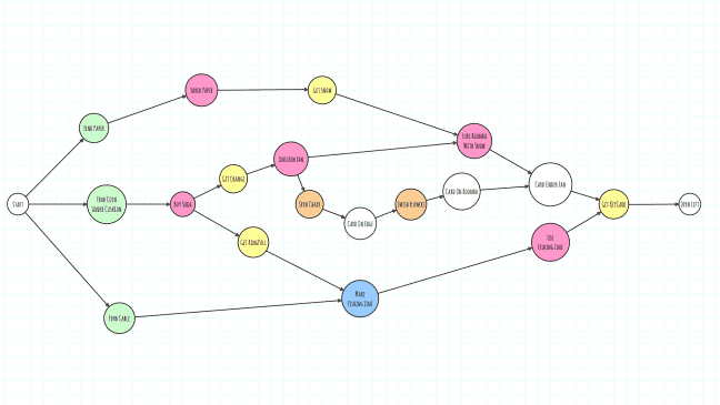
To start with you could probably just use a pencil and paper, things will get confusing and messy real quick though. You’ll want to be editing and rearranging your charts as you go along and graph drawing software makes this so much easier, it should also provide you with some useful tools for automatic organization and layout. Ron mentions he uses OmniGraffle but that only seems to be available for Mac, and Graphviz which looks faintly terrifying. So instead, I’ve been using the freely available yEd – Graph Editor, it runs on Windows, Mac and Linux, and so far it seems to be working really well. This is my chart for the very beginning of Toryansé, I’ve blurred out most of the text to avoid spoilers…
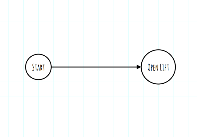
It might look complicated at first glance but if you start off with just the basics and work backwards from your goal the whole process is really intuitive. In its simplest form the scene looks like this:
The start state doesn’t actually need to be there, I like to feel like I’m editing a chart rather than spreading out into infinity though, so I usually define at least a vague beginning and end first. The player begins with no items, faced with several locked doors, a lift that wont open and a keycard which is out of reach, the scene ends when the lift doors open. In order for this to be achievable, the player needs to have the keycard, so this is our first dependency: To open lift the player must first get keycard. We need to split that line and add in an extra state…

The basic actions in yEd are pretty self explanatory, you select and draw nodes, connect them to each other with edges and you can then add styling, labels etc. What I didn’t spot straight away was the current elements menu, over on the right by default. As you draw and style nodes, a little palette of variations builds up from which you can drag and drop, much handier than constantly having to restyle the basic elements every time! It’s also a really straightforward way of inserting intermediate nodes into already existing edges as you can see above.
The rest of the chart is built up in exactly the same manner, I started at the end goal and worked my way back, adding in what was directly necessary for each step. I’ve colour coded my nodes. This isn’t strictly necessary, but I found it really helps when looking over a zoomed-out chart. The colours correspond to different types of basic player interaction, as you work your way through your scene and work out if your current state is dependent on one of these actions happening first.
- White nodes are environmental states
- Green is an item picked up from the environment
- Pink is using an inventory item on the environment
- Yellow is an inventory item as a reward for an action
- Orange is directly manipulating the environment
- Blue is combining inventory items
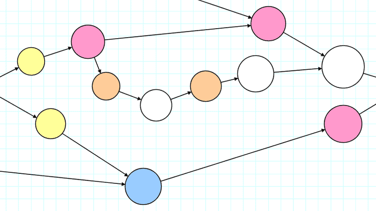
If you look back at the first image now, even without any text, you can quickly get a sense of the rhythm of the scene. It starts off with a little flurry of item collecting, this opens up some options for using inventory on the environment and a single inventory puzzle and there’s also a short, linear section where the player manipulates the environment directly. Although I was surprised how parallel even this simple scene was (before I drew out the chart I assumed it was all entirely linear!) this is working pretty much how I want it to. In later scenes however, I might want to make sure different types of interactions are more evenly spread out or, once players are more used to the direct-manipulation mechanic, I might want to make sure it’s more integrated into scenes rather than separated off as it is here.
Having a clear, visual representation like this is a super useful way to check over scenes you’ve already blocked out to check for various kinds of bottle-neck or long stretches of repeated interactions, this stuff might seem like it would be obvious but certainly I’ve found I play my own game very differently to people coming to it completely cold. These charts give you a slightly more objective perspective on how your game is working, if players are routinely getting stuck in the orange and white areas (they were!) then I know there’s an issue with that sort of interaction, if they’re all losing interest around the same pink area perhaps I’m not signposting interactive elements clearly enough.
Using different coloured nodes also allows you to sketch out different kinds of scene even before you have your items and puzzles nailed down, in-game shops or store rooms will have a similar look, mostly green for me, while action-oriented set pieces in Toryansé are likely to be dominated by sections of orange and white.
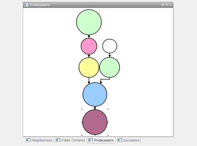
Over on the left hand side by default is another handy little menu that gives you several different ways of seeing selected nodes in context.
Predecessors is particularly handy for quickly seeing how convoluted a path to a specific state is!
There are probably vast swathes of other information available via different tools and menus I haven’t yet uncovered, but that’s a brief outline of how I’ve been going about designing my puzzles so far!
As always, comments, crits and corrections are all welcome.


